Use layout components
Structure and organize your forms with sections, groups, tiles, pages, static text, and visual spacers.

Section
The Section groups related fields under a visible heading with an optional description, creating a clear boundary on the form. Sections are the top-level organizing container.
Sections cannot be nested. Use a Section for the top-level grouping, and Groups or Tiles inside it for sub-grouping. A Table must sit directly inside a Section.
Group
The Group is an invisible container that groups fields for logic, without adding any visual styling. Use it to apply a Show/Hide Field Rule or a Visibility condition to several fields at once - for example, showing a whole set of fields only when a specific dropdown value is selected.
Groups have no visible styling. Submitters see only the individual fields inside - they cannot tell where a group begins or ends. For a more visible container, use a Tile instead.
Tile
The Tile displays fields inside a card. Use it to visually highlight a set of fields - a summary box, a contact card, or an approval area.
Properties
- Border
- Toggles a border around the card.
- Background
- Sets the card's background color. Use subtle colors so the tile stands out without overwhelming the form.
Page
The Page component splits a form into multiple pages, with Next and Previous buttons to move between them. Use pages on long forms to reduce visual overwhelm and create a wizard-like flow. Like other components, a Page has a Visibility setting and can be shown or hidden with a Show/Hide Field Rule.
Group related fields on each page so the flow reads like a wizard - for example, "Personal Info," then "Employment Details," then "Review and Submit."
Text
The Text component adds static, formatted text to your form's layout - titles, instructions, and body copy. It is a display element, not a field, so it collects no input. Click the text on the canvas to edit it with the inline rich-text toolbar (bold, italic, lists, links, and more).
Properties
- Background
- An optional background color behind the text block.
- Margins
- Margin Top, Bottom, Left, and Right (in pixels) to fine-tune spacing around the block.
The static Text element lives in the Basic section of the component library, next to Input and Textarea. For the text input fields submitters fill in, see Use text input components.
Upload an Asset
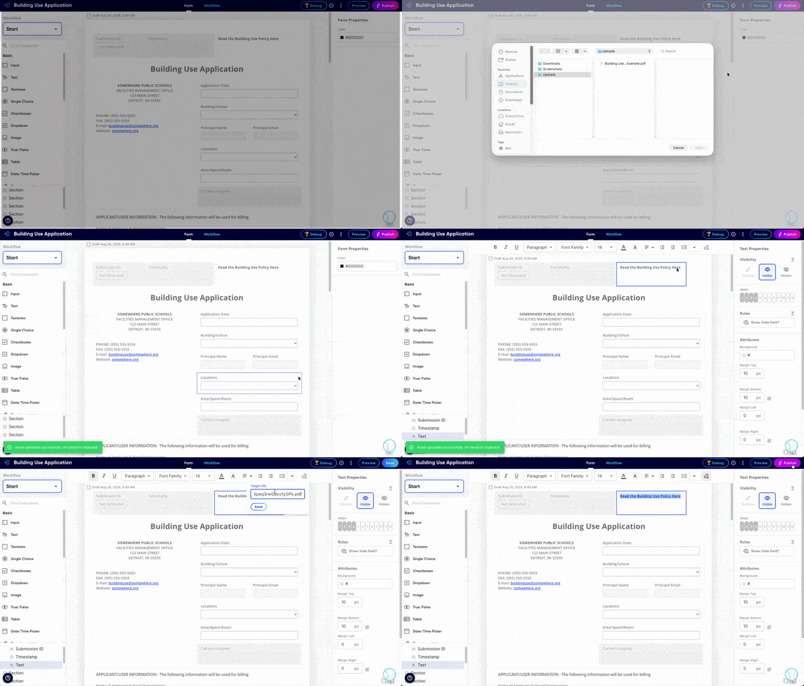
Adding supplemental resources like PDFs, videos, or images to your form can be done using the text component.
Open the form builder. Click the three-dot menu in the top-right corner and select "Upload Asset." Once your upload is successful, you'll see a green notification at the bottom left corner of the screen that says, "Asset uploaded successfully. URL saved to clipboard."
In your text component, type out the text youw ant to link to the uploaded asset. Highlight it. Click the link icon in the formatting toolbar, then paste the copied URL into the field.
Save your work and use the workflow tester or preview to ensure everything is working.
Spacer
The Spacer adds vertical white space between fields when they need more breathing room than the default spacing. You can set its Width and Height, in pixels (default 15) and set a Show/Hide Field Rule to control its display conditions.
Divider
The Divider adds a horizontal line between fields. Use it to separate groups of fields within a section.
PDF Page Break
The PDF Page Break controls where page breaks fall when a submission is downloaded as a PDF. Place it between fields to force a new page in the PDF output. It is invisible on the form itself - submitters never see it, and it has no effect on the on-screen layout.
Frequently asked questions
What's the difference between a Section, a Group, and a Tile?
All three are invisible container components (unless you add a border or background) that can have display rules. Sections are the standard container that everything else must live inside; they’re always full width and can be styled. Groups sit a level up, holding one or more sections, and can’t be styled at all, making them best for conditionally showing or hiding chunks of a form. Tiles are the most flexible: they live inside sections, can be styled, can be narrower than full width, and can nest within each other, making them ideal for packaging components into card-like layouts.
Can I nest Sections inside other Sections?
No. Use a Section for the top-level grouping, and Tiles inside it for sub-grouping.
How many pages can a form have?
There is no hard limit, but keep forms under about 10 pages for a good submitter experience. If your form needs more, consider splitting it into multiple forms.